Gift Cards
Gift Cards
Options/settings
If any gift card functionality is needed to be changed, such as gift card values or setting expiration dates, they will need to be changed through the Gift Certificates Settings section in BigCommerce. The options available for change are:
| Setting Name | Setting Description |
|---|---|
| Select a currency: | Select the currency for the gift cards. |
| Enable Gift Certificates? | Toggle ALL gift cards on/off (do not toggle). |
| Gift Certificate Values: | Switch between set amounts or allowing the customer to input their own amount. If list is selected, seperate the new values using a new row return ⏎. |
| Gift Certificate Expiry: | If enabled, set how long after the purchase date the gift certificates have till they expire. |
To get to these settings, Navigate to the Marketing tab in BigCommerce → and select the Gift Certificates subsection.
WYSIWYG intro
The current BigCommerce Gift Certificate editing system is a bit old.. 🦕. These Docs should hopefully break it down into easier steps but if not, feel free to reach out to the Web Devs.
To change the design of the Gift Certificats, BigCommerce uses an old WYSIWYG (What You See Is What You Get) editor. What this means is how you see it in the editor is how it will appear to the clients users (minus the %%variables%% which will be filled with their info). This tool gives you access to change font size/family, text color, background color and image, imbedding links, etc. It’s a powerfull but a bit clunky. If Designs require a large rework, it may be best to send a ticket over to the Web Devs and let them handle it. If not, continue reading to learn more.
To access the WYSIWYG editor:
- Select the Storefront Tab in BigCommerce → then Gift Certificate Templates
- From the list of Templates (sorry, we can not change the names apparently), choose one and select the
…button under the Action Column*. - In this menu, select
edit. This will open up the editor.
- This menu is prone to glitches. If it will not open up, select another
…button on a different template and then try again on the correct one.
Basic Usage
As stated above, you can change a lot of things with the WYSIWYG editor. The intire layout is based around tables so if you’re familiar with excell, you’ll feel right at home. If you’d like to keep the current design and just change the background color, continue on to Advanced Usage Here’s a breakdown of some basic editing you can do:
| Option | Setting | How To Edit:*** |
|---|---|---|
| Text | ━━━━━━━━ | Highlight the text that you need to change. |
| Font Size | Font Size ⌄ Choose a font size from the one of the options in the Dropdown Menu*. | |
| Font Family | Font Family ⌄ Choose a basic font family from the one of the options in the Dropdown Menu*. | |
| Style (bold,Italic,underline) | B, I, U Change the font styling. | |
| Text Color | 𝐀 Change the text color. Select from the preselected grid of options or click More Colors... to choose from a color slider or insert a Hex code (#) | |
| Alignment | ☰ alignment icons . Align text left (default), right, center, and justify**. | |
| List | ≔ change the text styling into either a bulleted or numbered list. | |
| Background | ━━━━━━━━ | Select the cell that you wish to edit. |
| Color* | ◫⬒◫ or ⬒⬒⬒ (cell and row menus) → Advanced Tab → Background Color. Input box for #Hex code or pop-up to select from a color slider menu. | |
| Image | ◫⬒◫ or ⬒⬒⬒ (cell and row menus) → Advanced Tab → Background Image. Add Image URL to the textbox. | |
| Insert/Embed | ━━━━━━━━ | Select the cell / highlight the text that you need to insert the content into. |
| Link | 🔗 Add/Edit/Remove a link for highlited text. | |
| Image | 🖼 Add Image from URL or from Gallery of uploaded images. | |
| Video | 🎞: insert File URL paths or the Youtube Icon: Add the hosted video (youtube, vimeo, etc.) link. Both will add video to the template. | |
| Table | ━━━━━━━━ | Select a cell in the table |
| Row | ▄<sup>↤</sup>▀: Insert row above, ▀<sub>↤</sub>▄: Insert row below, █↦: Delete row | |
| Column | ↧▄▄: Insert coloumn before , ▄▄↧: Insert column after , ▀↧▀: Delete column |
* More advanced usage in the HTML Editor
** Pretty much don’t ever use justify..
*** Close Aproximations of what the symbols look like. Hover over them in editor to read the tool tip and verify setting name.
Advanced Usage
The WYSIWYG editor allows you to directly edit the HTML using the ᴴᵀᴹᴸ menu. This will open up a pop-up with all of the code laid out in front of you. Do not touch this if you do not know what you are doing. This section will mostly be for the Devs to edit but there are a few simple things you can change in here. If the design is still the basic card, you can come in here and change the text and the background colors.
Near the top of the pop-up, you should see a <style> tag and further down, a closing </style>. Anything between these two tags is CSS and it is where we will find the colors and other design elements. CSS is organized by selectors such as class names (.class-name-example), ID’s (#idexample), or just targeting the tag (h1, h2, p, etc.). In the html below the </style> inside the <body> tags, you will find the table that has all of our content. You will notice that some html tags will have class="example-class" or id="exampleId" inside of them. Match these class names or ID’s to their counterpart in CSS to edit their styles.
In the basic design (subject to change), there are 5 different areas for changing the colors:
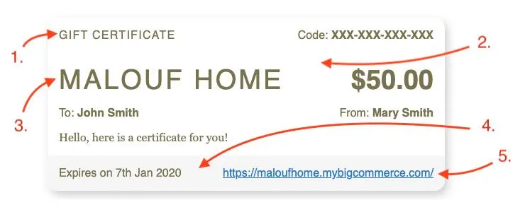
-
Main Text Color:*
td { color: #78714D; } -
Main Background Color:*
.GiftCertificate { background: #ffffff; } -
Heading Text Color:*
.StoreInfo, .StoreInfo a, .GiftCertificate h1, .GiftCertificate h1 a { color: #78714D; } -
Bottom Background Color:*
.GiftCertificateShopNow { background: #f6f6f6; } -
Text Link Color:*
.GiftCertificateShopNow a {
    color: #2278C8;
}
- selectors will have other content inside of them besides
color:/background:
Preview
On the Gift Card purchase page, there is a small preview of what each card will look like and the name (screen reader only) of the template. These can be changed in the theme settings on PageBuilder. In the Theme settings menu, you will now find near the bottom, a Gift Certificates and a set of options for each template. Try to match these colors up to best represent what the card looks like. If needed, you can use the actual colors from the gift card.
| Option Name | What it does |
|---|---|
Theme Name | The new name of the template. |
Color 1 | The main background color or the gift card. |
Color 2 | The secondary background color. |
Color 3 | The main color of the text (‘M’ logo) |