Backlist Products
Hiding the Subcategory
In order to backlist products for Specialty Retail, we are using a combination of a hidden category and subcategory. You, too, can backlist products with these few easy steps.
- Create a hidden category as well as a visible subcategory. To make a category hidden, simple toggle the visibility column. This step is already done on the Malouf Home site. You will assign the backlisted products to the subcategory. Unless you want additional hidden categories, you can use the ones already provided in the admin.
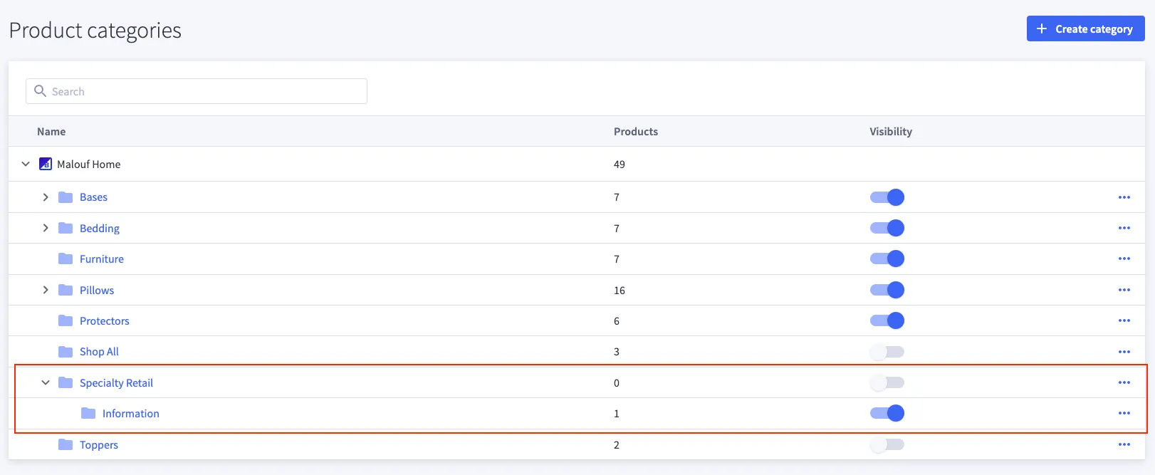
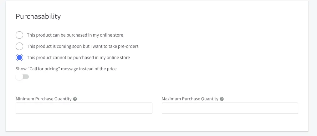
- Go to the product page in the admin. Assign the product to the subcategory mentioned above (shown as “Information” in the image) and set them to non-purchasable.
Now you can directly hit the subcategory or the product page url without users being able to navigate to it.
Product Settings
Since backlisted products use a different design than the default PDP, they have different settings available to them. Make sure you change all of the necessary settings otherwise the product page will not display correctly.
Template Layout file
In order to not use the default product page for our backlisted items, we’ll need to change the template layout file. To do this:
- Go to the backlisted product’s page in the bigcommerce admin
- Scroll to the Storefront Details section.
- Click on the Template Layout file selection box and choose backlist from the options.
- Save 💾
Custom Fields
While backlisted products don’t have access to all of the same custom fields, they still have access to some (and even a unique one).
| Custom Field Name*: | Custom Field Value(s): | Description |
|---|---|---|
dimensions-... | Product dimensions | Enables the dimensions component and displays the value. (can be used more than once) |
spec | Additional information | Add additional information/specs to the product page. |
tagline | Tagline text | Add the product tagline. |
warning | prop65 | Turn on the Prop65 Warning for this product. |
Additional Information
spec
This is a grid-like component for displaying custom information right below the product options section. It’s designed in a way for you to input any values needed and have them displayed to the users. Initialize the component by adding the Custom Field Name spec. This custom field can be used as many times as needed.
The Custom Field Value will be broken apart into the information to be shown. The component is searching for two pieces of information separated by a semicolon (” : ”). It will then display what’s left. The first half will be the name of the information. The second half will be the value.
ex:
| Custom Field Name: | Custom Field Value: |
|---|---|
spec | Key Feature:Double Sided |
This input will appear similar to this:
Key Feature Double Sided
Description
The product description for the Backlisted products template appears below the options and gallery section on the page. It is set up to allow you to insert whatever content is needed into it, such as media, lists, plain text, etc. The description input uses a WYSIWYG editor. This means that what you put in there and how it looks is roughly how it will look on the page. There have been some changes though to help with layout and to keep a consistent design.
Layout
The description component was designed to receive content in chunks. On average, it will have 2 chunks per row on larger screens before wrapping to the next row. If the items are small enough, more will be added per row. In order to divide the Description into chunks, use the Page Break ⎶ in the WYSIWYG editor. The break will appear as a dotted rectangle ⬚ in the editor. The component then knows to look for these breaks and uses them to create a new section.
WYSIWYG Editor
The WYSIWYG editor gives you access to a few design tools for you to use.
Fonts: The only thing you can’t do is change the font size of paragraph text or change the font family. You are allowed to change the color, style (bold, italic, underline, etc.), background color, and more.
Links: Links can be added and removed using the link 🔗 icons. If you need the link to open in a new window, set the Target dropdown to New window.
Lists: Lists are allowed to be created. You can choose between ordered and unordered lists. Ordered lists have had additional styling changes added to bring them more inline with the rest of the site.
Media: Images and videos can be added using there respected controls. More about adding Images
Adding Images
To add an image, first start by clicking the Insert/edit Image button. There are 3 bits of information you need to know to use this. Source, Description, and Size.
Source: You have two options of selecting a source for the Image. You can either give a direct source or upload an Image. The Direct source either requires the URL or the file path. If you’d like to use the file path of a previously uploaded image in the Image manager, all you need to enter is /product_images/uploaded_images/ then the full name (file type included) of the file.
Ex: /product_images/uploaded_images/linen-weave-cotton.jpg
Description: Please enter a good description of the image. This is to help those using screen readers or poor connection. Avoid starting the description with “Image of …” as this would be redundant.
Ex: A folded sage colored Linen-weave sheet set on a white backdrop
Size:
If left unchanged, the image will default to it’s original size. Uncheck the constrain proportions box and leave the height empty to prevent the image from being distorted. 425px wide would be the average size of a medium sized image for this location. Images can be bigger or smaller if necessary.