Home Page
To manage content within the Lucid home page, we will be using custom widgets in page builder mode. If you are new to page builder, please read the BigCommerce documenation.
Below you will find information about the more complex widgets being used on the home page and how to update them. Each region will have a list of widgets below it’s name that were intended to use for that region.
This documenation will cover both v1 and v2 of the Lucid Homepage designs.
Basic Widget Rundown
Widgets can be added to Regions in Pagebuilder. In the Pagebuilder menu, you will see a list of widgets. Simply drag and drop them into the highlighted regions on the page to add them. Once added, the Pagebuilder menu will then switch over to the widgets settings menu.
You have 2 main types of widgets; Array Types and Tab Types.
Tab Types are the defualt. They appear in Page Builder as basic dropdown list(s) with inputs that control the widget.
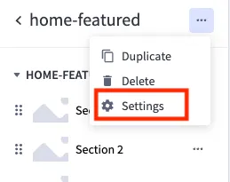
Array Types are like Tab Types that allow you to add or remove repeated sections. They can have additional controls hidden behind the “⚙️ Settings” menu. If this is the case, the doucmentation for the widget will have “⚙️ Settings: True” below the widget names. You can find the “⚙️ Settings” menu in Pagebuilder by selecting the widget and clicking on the elipsis (···) next to the Widget’s name.
Widgets
Hero
hero
A hero image/icon with the main CTA.
The hero widget should be able to accomplish any design that gets sent over. The design should be sent over with additional settings that will align with the inputs in the widget. One of the main features with this widget is that as you change the theme and toggle settings, additional inputs will be added/removed to reduce the visual clutter (except for the mobile text color options when you have “full” selected as the theme 😡). By default it has almost all of its fields enabled so you can see what it is capable of.
Here are some of the main inputs and how they control the theme:
| Name | Type | Value(s) | Function |
|---|---|---|---|
| Theme | select-box | Full Bleed, Split, Framed 3:4, Icon | This is what determines the main look of the widget. The names of the options correlate with the theme names in the design. |
| Reversed | checkbox | ✅ | Swaps the order of the image and the text on tablet and desktop. (Full Bleed will simply place the text on the right or the left side and keep the image in the back) |
| Add … | checkbox | ✅ | Used to add the content labled after the “Add”. ex: “Add Tagline” adds a tagline above the Title |

- Tagline:
- Text above the title.
- Title
- Subtitle:
- Text below the title.
- Paragraph:
- Main copy for the widget.
- Can have it’s own max width set inside the “Max Widths” tab.
- Code:
- The “use code” text and the code can have different colors.
- Buttons:
- A second button can be added after the first.
- Use the button theme selector to change it’s colors/style.
- Terms/Exclusions:
- A link can be added if needed.
- The text can be “floated” to the left, center, and right if needed.
- Scrim:
- This input is only added if
Full Bleedis selected as the theme and is in the “Background” tab. - It is the gradient that sits behind the text to make it more visible.
- Choose a color and then choose the opacity of the scrim (alpha channels will be removed in color selection).
- This input is only added if
Icons List
icons-list : Array Type , icons-list-v2 : Array Type
⚙️ Settings: True
A list of icons with text that is meant to span the full width of the page.
Category Cards
category-cards : Array Type
⚙️ Settings: True
Square images with links and text inside of a carousel.
While the array inputs are fairly basic, the hidden settings can get a little more advanced. You won’t need to tweak these too often, especially things like padding or min/max width. This widget does have some specil features to note.
- Text Shadow & Card Scrim : Used to increase the contrast between the text and the image. This will be enabled on all cards (for consistency’s sake) and you should only need to enable one or the other.
- Background : Unlike in other widgets, you can choose between 3 background types with this selector: None, Solid Color, and Split Color. Doing so will hide/show more inputs for background colors. If you selected Split, you will be given 2 inputs for colors and the background will be divided in half.
Mattress Quiz
find-your-mattress
An icon (.svg) and link to take you to the mattress quiz
The most noteworthy setting about this widget is the the HTML Editor aspect of it. This is used so you can copy the svg code and paste it directly into this input to add the icon to the page.
Split Image Section(s)
split-image-section
A section that is split between an image and a block of text with a link.
This widget was designed to be a bit more versitile as simlar regions are used across the site. It’s tabs are broken up into Content, Color, Button Settings, and then layout changes at different screen sizes. This widget will start stacked vertically but then switch to a horizontal split. Some unique settings:
- Content : While most content textboxes are straight forward, this one has the added feature of allowing multiple paragraphs. If you were to add a new line (
↩ Enteron your keyboard), a new paragraph is added. - Reverse Split Section Flow : If checked, this will cause the image to go to the right side when switching to a horizontal split.
- Button Color : Setting the Button Color to Custom will add a few more inputs that will allow you to fully change the buttons colors at different states (hover & base).
- Horizontal Flow : In the Tablet View size, you have the option of checking this box. If Checked, the widget will switch from the stacked mobile view to the horizontal split view at tablet screen sizes.
Why Choose Us Section
why-choose-us : Array Type
⚙️ Settings: True
A list of icons with paragraphs and headers that will swap to a carousel on mobile sizing.
Selecting Custom from the icons list will give you an input for the custom icon’s name. This will match any icon stored in WebDav: at /content/icons/. learn more about WebDav:
Featured Products
featured-products : Array Type
⚙️ Settings: True
A carousel of product cards.
Most of the legwork for this widget is done with the Product input. Search for a product by name or sku and the card will populate with it’s information. You can add a custom product tagline if you’d like or change the button text. This widget will show the pricing and size of the default variant.
Ticker Tape
ticker-tape : Array Type
⚙️ Settings: True
A list of icons meant to be in carousel until all of the icons fit onto the page.
Similar to the other icon selection inputs, selecting Custom from the icons list will give you an input for the custom icon’s name. This will match any icon stored in WebDav: at /content/icons/. learn more about WebDav:
The People’s Mattress
home-peoples-mattress
A simple header with an icon, an image, and text.
Like other header inputs, the Title input accepts inline HTML tags for styling purposes ( <em> , <strong> , etc).
Quotes Carousel
quotes : Array Type
⚙️ Settings: True
A carousel of quotes.
By default, this widget is set to sit behind the previous region with it’s negative Margin Top size. Set this to zero to remove this functionality. A Cite link can also be applied to a quote if applicable, such as quoting text found on some other website.
Comparison Section
same-for-less : Array Type
⚙️ Settings: True
A table of data for comparing pricing and features.
Nothing super special with the inputs, just make sure that for the price inputs, you add just a number without a ’$’ or commas. The widget will take care of the formatting and will use these numbers to calculate the total. Also, If the Company Name is set to Lucid, the Lucid logo will appear in it’s place.
Multiple companies can be added and the widget is set up to handle as many or as few as you want to throw at it, not just 4.
🚨 UPDATE THIS DAILY 🚨
Publication Quote Carousel
home-publications-carousel : Array Type
⚙️ Settings: True
A carousel of icons from publications followed by a quote from them.
Similar to the other icon selection inputs, selecting Custom from the icons list will give you an input for the custom icon’s name. This will match any icon stored in WebDav: at /content/icons/. learn more about WebDav:.
This widget also contains the Cite input to link your source. This would be applicable for cases such as quoting text found on some other website.
Instagram Feed
instagram-feed
A carousel of Instagram posts.
This widget works with our Behold account.
- Title : Like other header inputs, the Title input accepts inline HTML tags for styling purposes (
<em>,<strong>, etc). - Feed URL : This would be the Behold Feed URL that you get after creating a feed in Behold. You can access it anytime after creation by clicking on the desired feed in the Feeds tab in Behold.
- # of posts : The # of posts from the feed that you want to display. This number is need due to how the carousel is set up. You cannot exeed the number of posts the feed gives but you can shorten it if need be. If the # of posts is greater than 4, it will stay as a carousel even at Desktop sizing.
- Feed Type : This is the Feed Type of the Behold feed you’ve added, be it Advanced or Basic. Learn more about Behold feed types here.
Certified B Corp
certified-bcorp
A split between icons and text talking about B-Corp.
The only real special thing about this widget is that it’s Content input accepts Markdown. In practice, this means you can indent twice ( ↩ Enter on your keyboard), to form a new paragraph. You can also use markdown syntax to add inline styling such as Bold or Italic and even add links.